Logo for download
Our logo can be downloaded in different versions and sizes for print and for use on screen and is collected in folders that contain everything you need for print or electronic use.
The meaning behind
In all its simplicity, the logo expresses immobility and solutions.
The white lines are positioned horizontally and diagonally. The horizontal line symbolizes the lying position, but the two slanted lines symbolize the sitting position, in e.g. a comfort wheelchair.
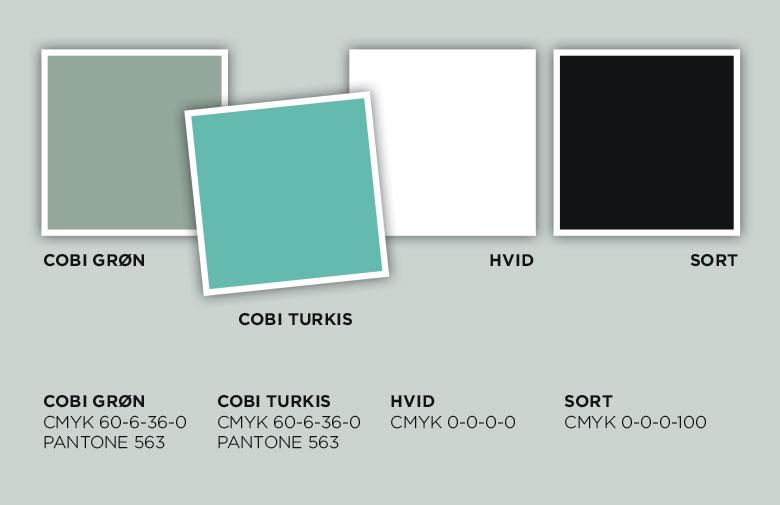
It was designed in 2017 in connection with the relaunch of our website. The relaunch of our website also ment introducing a handful of douce coulors that presents the different products we have .


